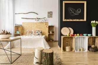
Wood tones can feel like a secret language. Your floors might read “golden honey,” while your cabinets are quietly saying “cool walnut.” Once you know what to look for, you can mix and match them intentionally, making the whole house feel pulled together.
Start With a Game Plan
If you want wood tones to feel intentional across a whole house, you need one simple rule. Pick an anchor, which is the wood surface that shows up the most and stays put. Usually, that means your floors, which are a significant feature you won’t want to change often. It can cost up to $4,500 to install flooring in a 500-square-foot room.
Once you’ve identified your anchor tone, select two or three additional wood tones for connected spaces. This keeps the look cohesive and avoids a busy showroom effect. Choose one light, one medium and one dark. You might choose contrasting tones to convey personality.
Decide on the overall mood that you wish to achieve. Woods that share undertones can feel calm, while highlighting a single contrasting tone and repeating it can feel more dramatic.
Learn to Read Wood Tone
Before you move a table or order new stools, you need a quick way to gauge the wood you already have. Designers do this almost automatically. Homeowners can do it, too, with a couple of easy checks.
The key is separating tone from everything else, such as sunlight, lightbulb temperature or the paint color bouncing around the room. Those things can impact wood’s appearance. Try viewing the wood in natural light, ranging from 3500 to 4100 Kelvin, to spot what stays true underneath all that.
You should identify the underlying color that remains consistent despite these effects. Start in natural light, looking at the largest wood surfaces first, then move to smaller pieces.
Check the Undertone
Undertones are subtle colors beneath the stain. Two brown woods may clash if one leans orange and the other gray.
Hold white paper beside the wood in daylight to reveal the true undertone. Woods that look more yellow or red are warm. If they appear smoky, green or silver, they’re cool.
Warm undertones often show up in honey, oak, cherry and many walnuts. Cool undertones pop up in weathered finishes, ash tones and many gray stains. Once you label your wooden floors or furniture as warm or cool, you’ve done half the job already.
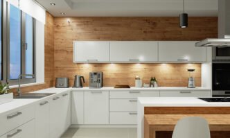
Separate Color from Grain
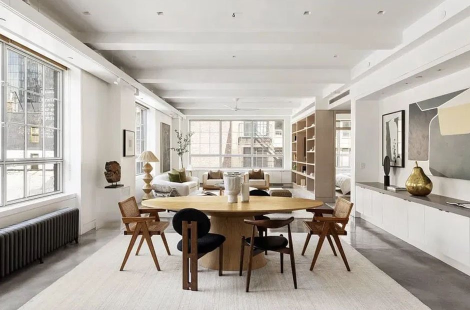
Color is the finish, grain is the species. They aren’t the same thing and behave differently when you mix wood tones. A stained oak cabinet might be the same color family as a walnut table, yet the grain reads louder. Oak has open, visible grain that feels busy and rustic. Walnut tends to read smoother and richer. Maple can look clean and quiet even in the dark.
Matching color alone won’t work if grain patterns conflict. If the floor’s grain is bold, the grain of nearby furniture should be subtler to balance the space.
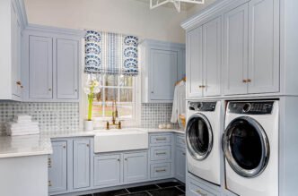
Floors to Cabinets
Floors and cabinets are two big voices in most homes. When they get along, everything else feels easier, and it’s noticeable when they clash.
Start by matching undertones. If floors and cabinets are both warm, you’re all set — even if they differ in shade. If not, add a bridging element, which can be anything from a countertop to a backsplash tile or runner that sits between the two tones. Even hardware can help. Matte black or soft brass pulls can act as a neutral pause between woods.
If your cabinets are the piece that feels off and you like everything else, refacing can be a clean fix. It keeps the layout and upgrades the visible wood tone, often saving thousands of dollars compared to a full remodel.
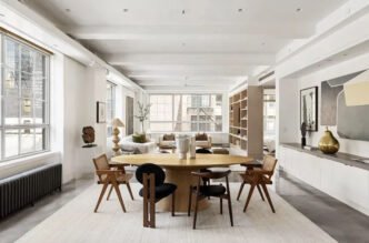
Cabinets to Furniture
Once floors and cabinets feel steady, furniture becomes the fun part. You’re aiming for repetition more than perfect matching. Repetition feels intentional, while one random wood tone could come off as accidental.
Pick one tone that already exists and echo it a few times. Maybe your cabinets are a medium walnut, so repeat that walnut note in bar stool legs, a picture frame and a side table. Small repeats add up fast.
Then add contrast without restraint. If everything is medium wood, the room can feel flat. A lighter piece can lift it, and a darker piece can ground it. The trick is to keep the undertone consistent, so your contrasting wood pieces still feel related.
When layering several wood furniture pieces, make sure at least one is simple in both grain and finish to create visual rest.
Trim Doors and Stairs
Trim and interior doors run throughout the house. If they change tone every few steps, the home starts to feel chopped up. Within the same sightline, aim for consistency. For instance, if you can see the stair rail and the living room trim from the entryway, keep those woods aligned. They don’t have to match perfectly, but they need to look similar enough.
If you already have stained trim that’s darker than everything else, treat it as the dark anchor and lighten the furniture around it. Alternatively, you can soften the contrast by painting the walls and textiles near the trim, so the trim looks intentional rather than heavy.
Stairs deserve extra attention because they sit between zones. A runner and a consistent handrail finish can do a lot of work.
Use Soft Buffers
When wood tones clash in a real home, you rarely fix it by hunting for a perfectly matching table. You fix it by adding buffers that slow the eye down.
Rugs are the biggest helper when you choose the material for the space wisely. Knitted rugs offer diverse fiber content and convenient widths, making them a popular choice for homeowners. A rug between the floor and furniture creates distance, so the difference feels curated. Curtains and upholstery can have the same effect. Even a woven basket or linen slipcover can calm a space that feels too wood-on-wood.
Paint works like a visual reset. A soft wall color can add color variety and make different woods feel more intentional. If your space has an open floor plan, you can also use paint to create zones so each one can carry its own wood mix without competing.
Grain and Bear It
Matching wood tones is more about establishing an anchor, repeating key tones and adding buffers than finding identical pieces. Focus on the overall impression rather than perfect matches. Step back from the doorway and trust the big picture.